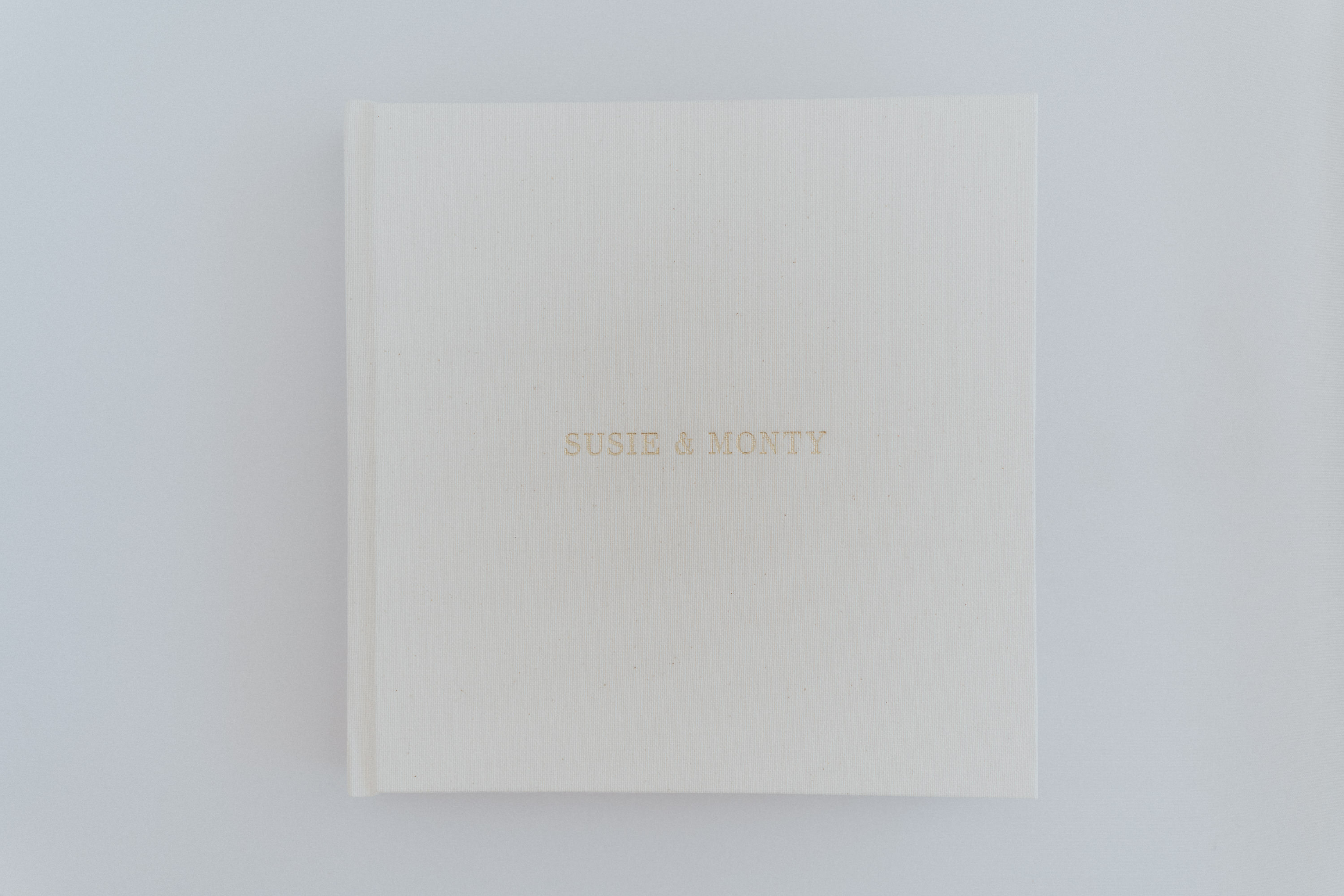
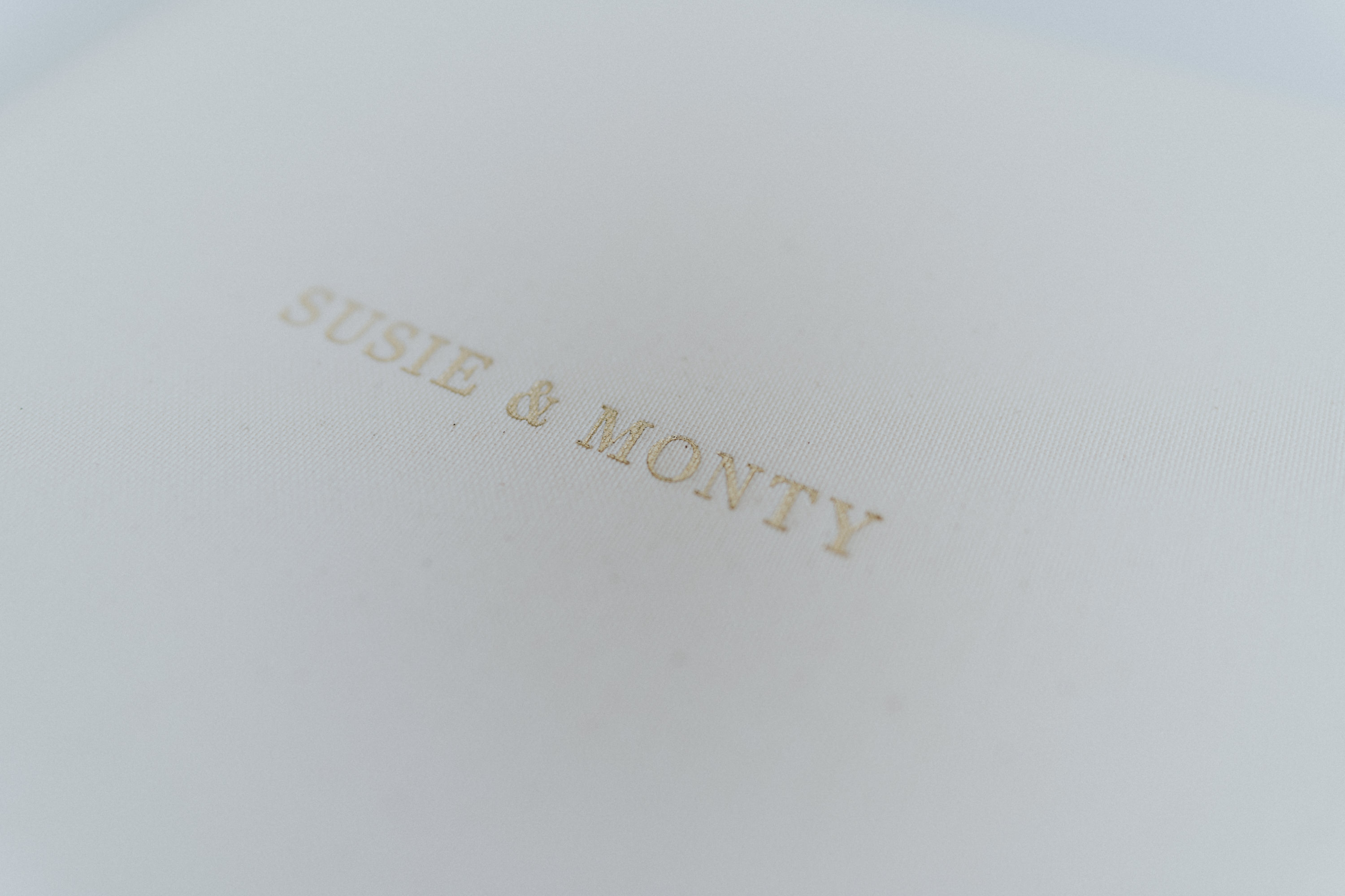
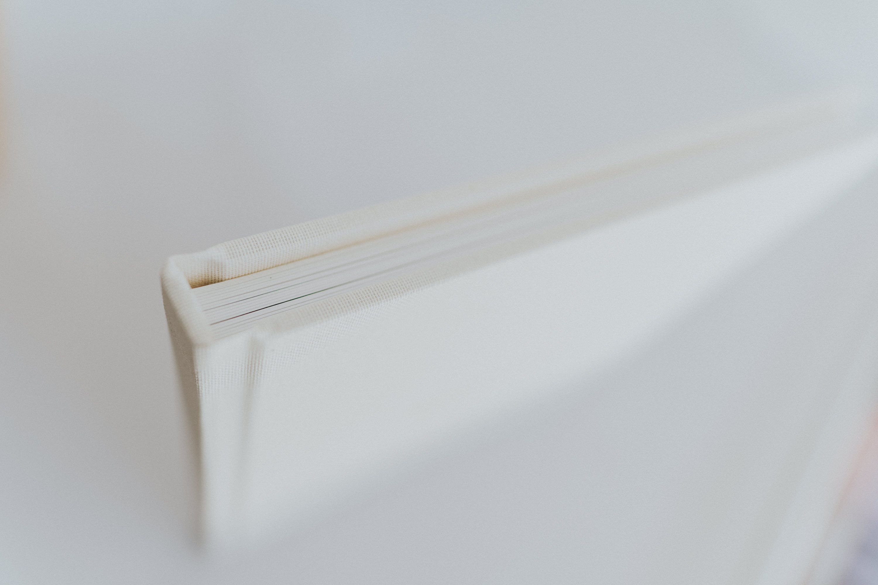
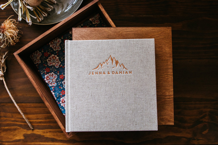
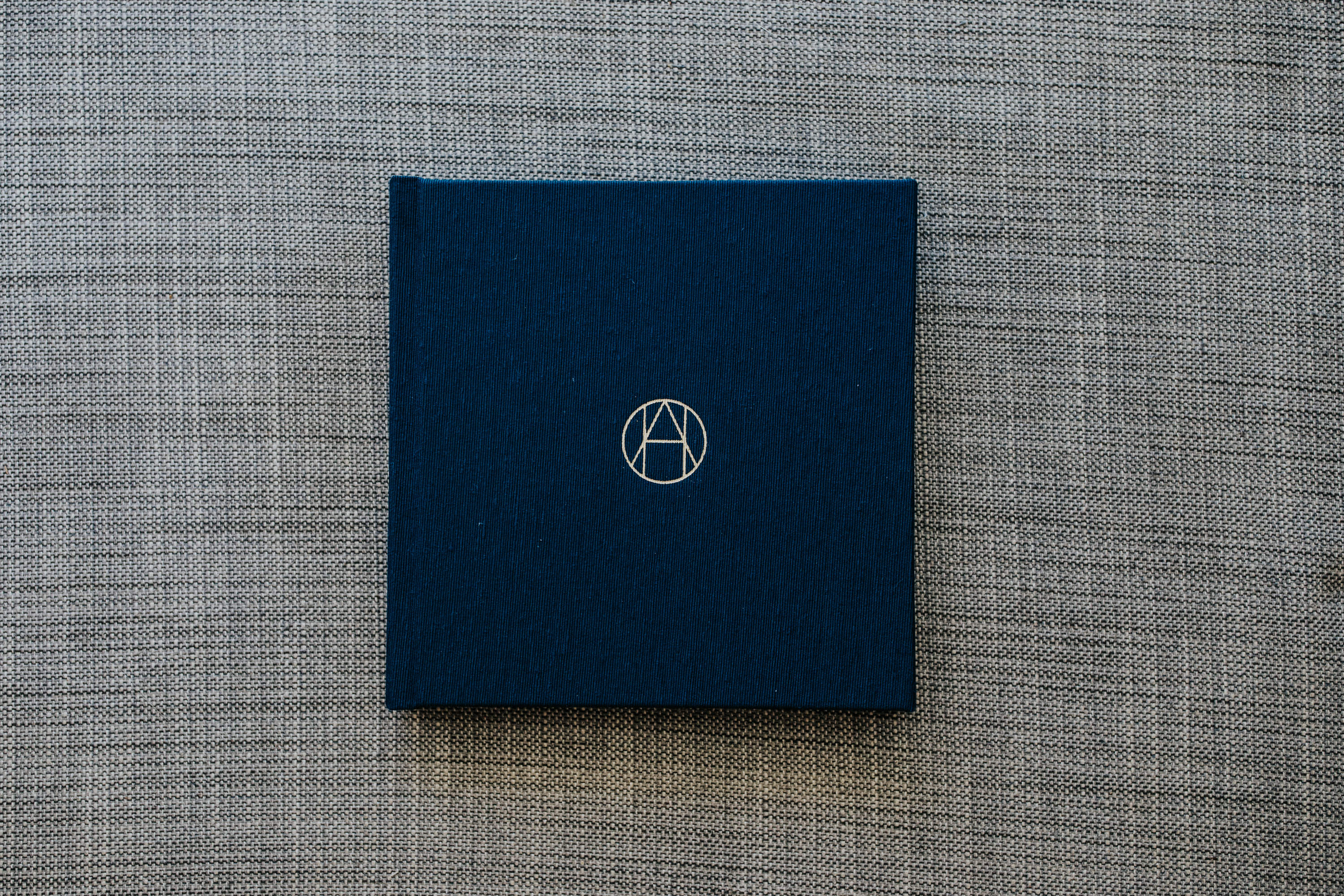
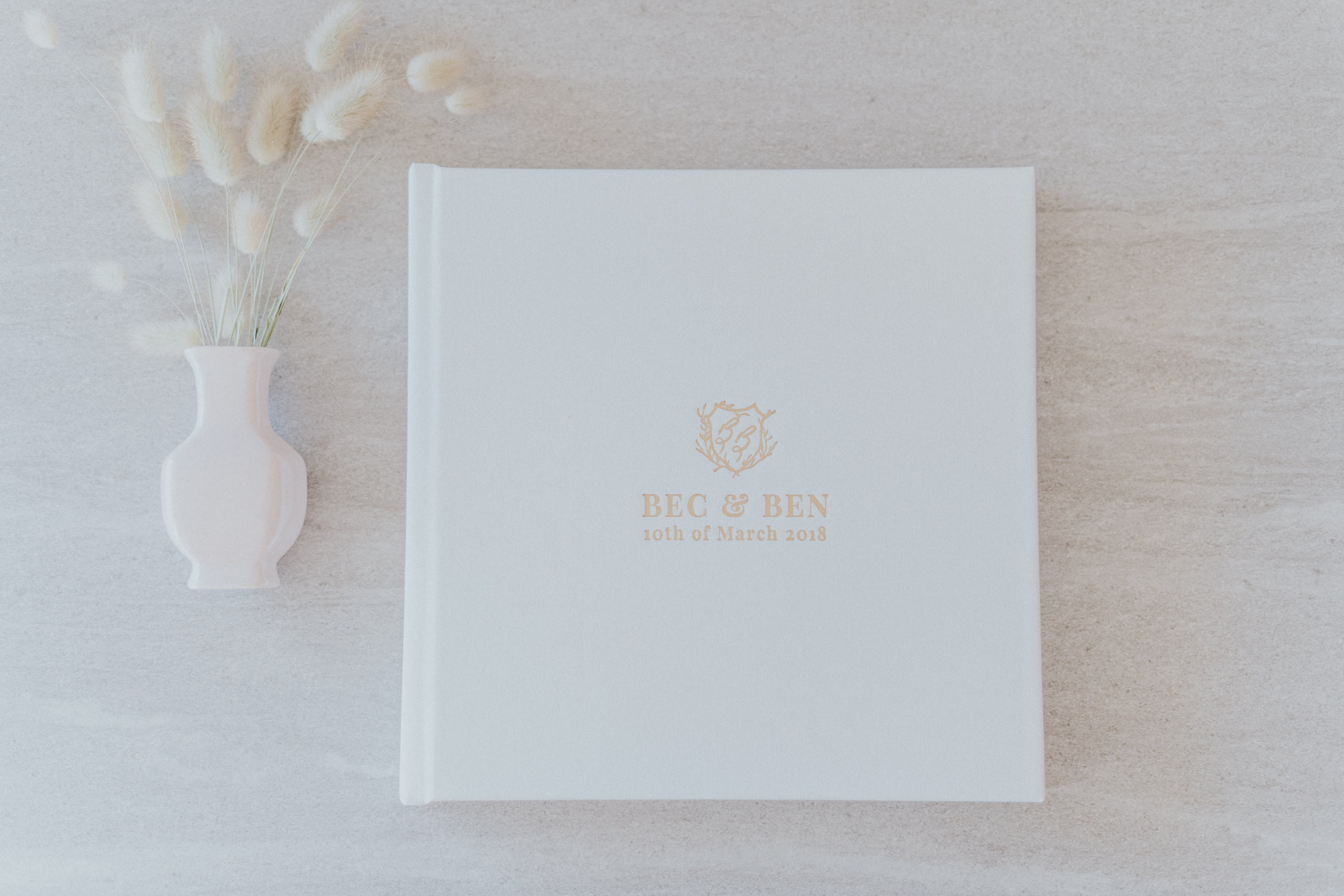
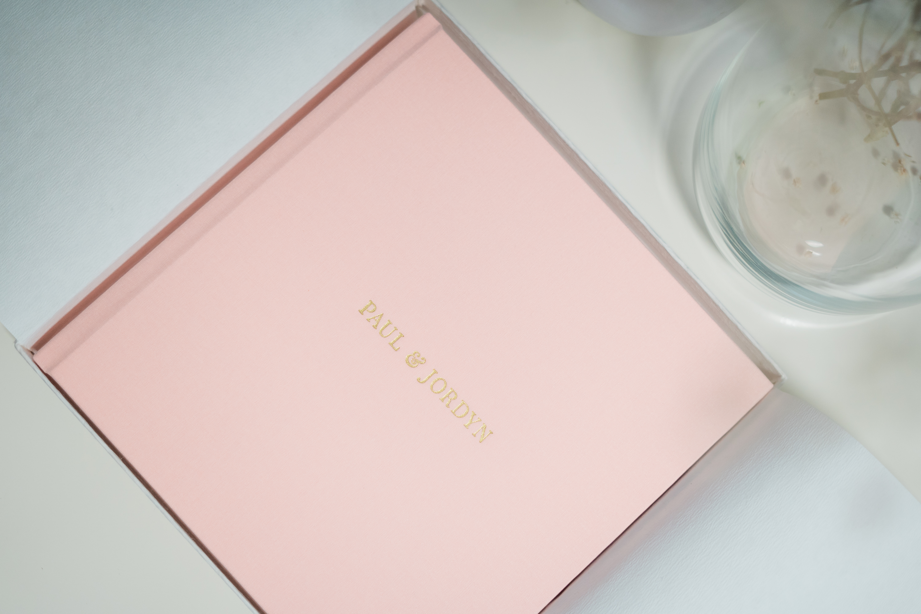
This cover is a lot more yellow in person than in photos and the swatch and has more speckles like in vanilla bean.
I'm not sure I would do it again but the client chose it. I think it looks a lot more yellow because of the white packaging and end sheets.
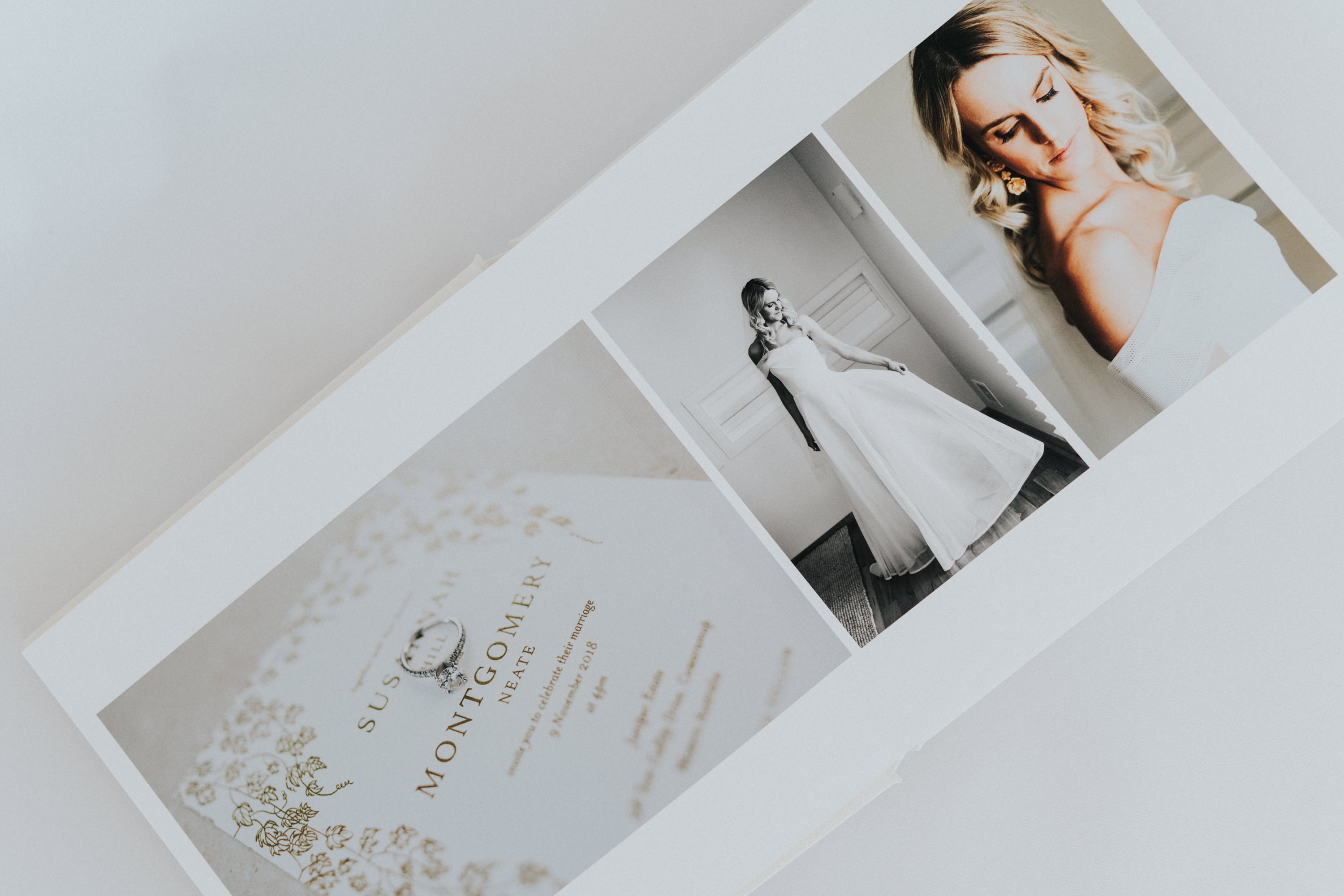
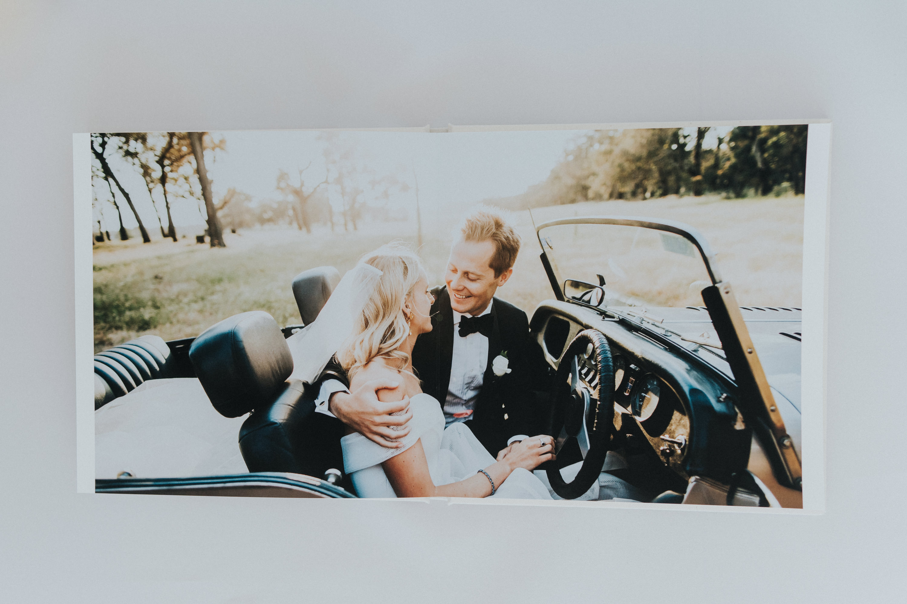
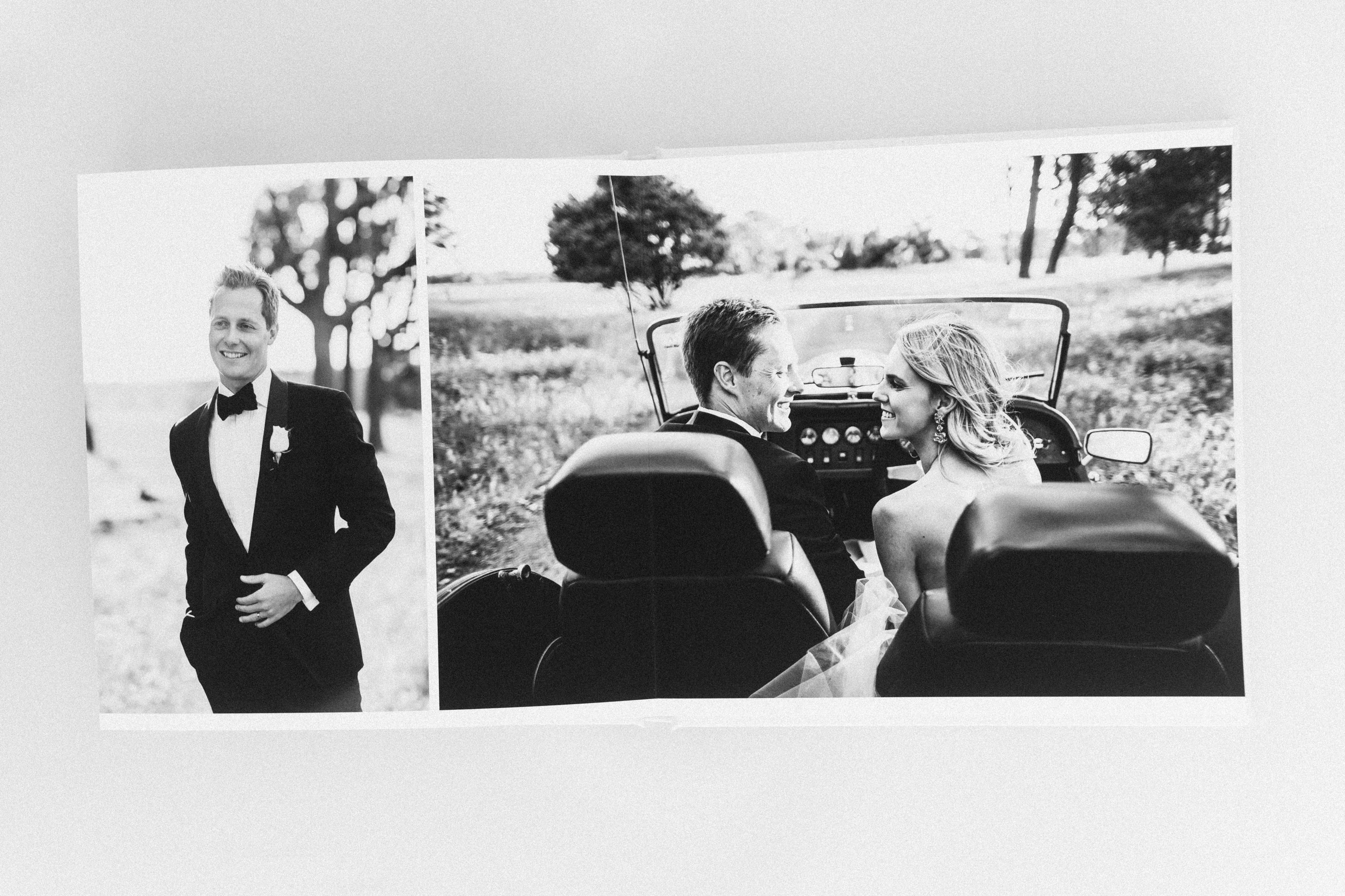
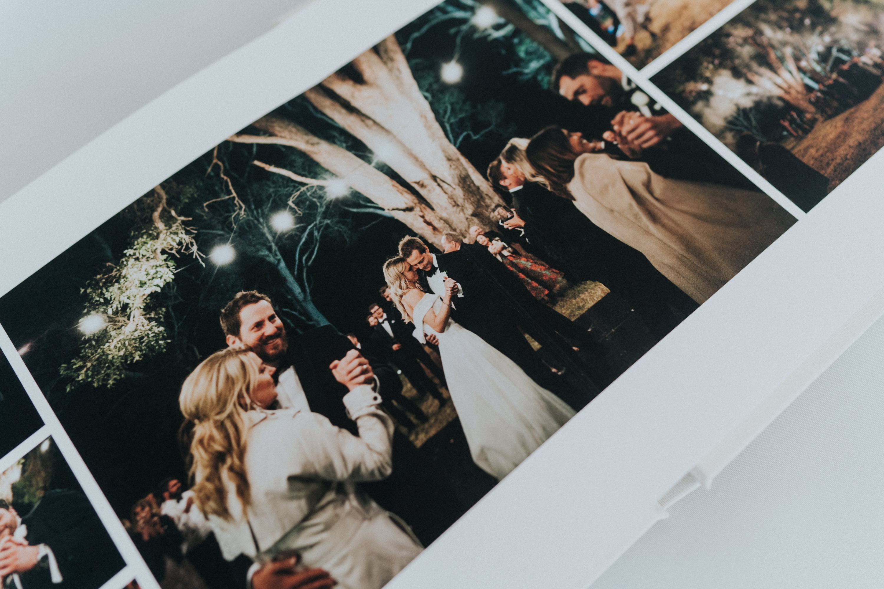
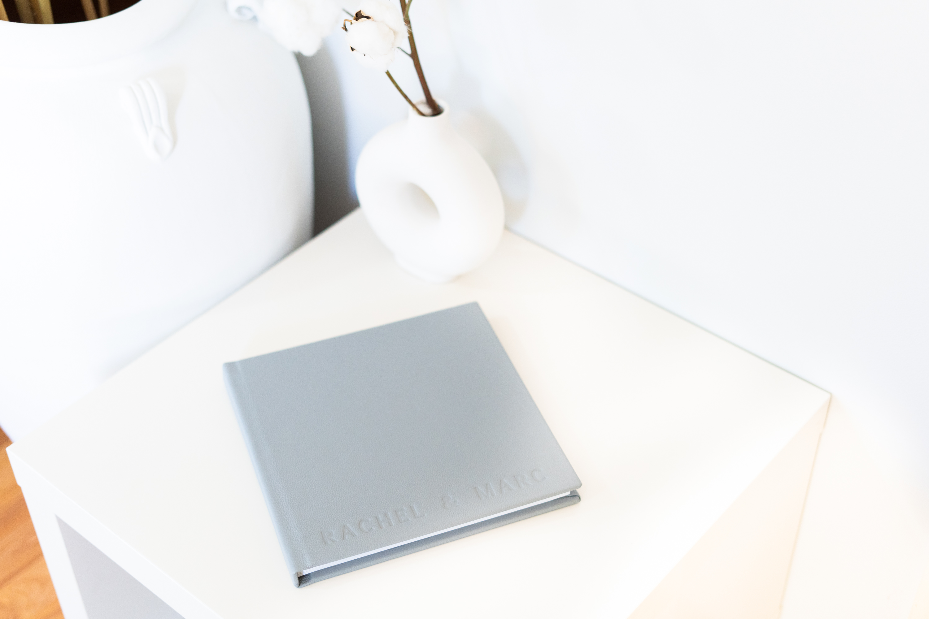
Other than that i love the album. The printing is spot on as usual.