
Debossing is a beautiful way to accessorize any album. However, like in fashion, there are specific rules to follow to look fabulous. What better way to know those rules than getting it straight from the guys whose job is to add the fine details.
We sat down with Andy and Jake, who combined have 16 years of experience in the art of debossing. Here are some of the questions we asked them:
How is Vision Art different than other companies when it comes to debossing?
"Some companies only have certain fonts that you can choose from or typed letters, but we've always given photographers the option to design their books however they want."
Where in the book can someone put a deboss?
Andy-"Pretty much anywhere on the cover, front or back. It can get a little dicey the closer you are to the edge of a cover, but we've developed things that make it possible to go all the way to the edge. If we think it will be a problem, we'll contact the photographer and let them know."
Jake-"Anywhere besides the gutter. You need to be careful at the corners, especially."
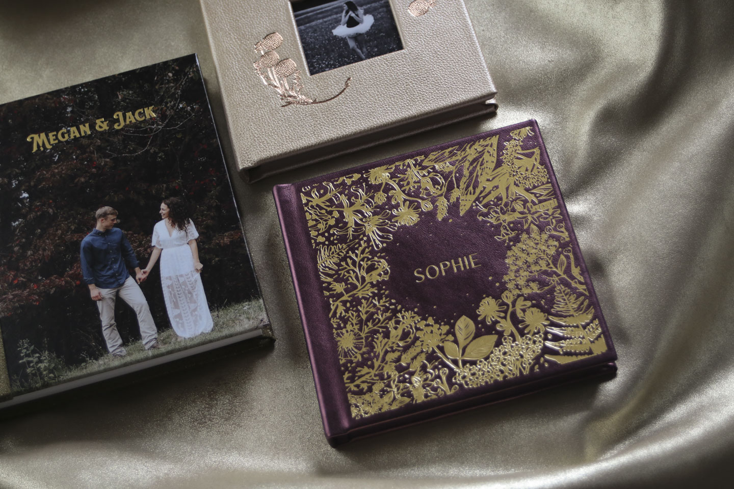
Vision Art gives a lot of creative power to the photographer/ designer. In addition to the cover, you can also deboss the spine, endsheets, and spreads.

Are there certain materials that deboss better than others?
Andy-"There are materials that are easier to deboss than others. Any smooth material is easier and shows the details better. Textured materials such as full-grain leather and uncoated book cloth can start to compete against the foil. In other words, you won't have crystal clear edges because the foil wants to follow the texture. This can cause some of the edges of the design to lose some of their details."
That's an excellent point to keep in mind when designing a deboss and choosing a cover material.
What else should a photographer/designer keep in mind?
Andy-"If the detail is too fine or too busy, the deboss will tend to stamp all into one blob, choking out the fine details. So when I advise someone, I tell them that 'less is more.' The simpler the design, the cleaner it will look and the happier you'll be with it."
Jake-"One major thing is making sure your designs aren't too thin, ensuring that they have enough meat on them so we can make the dies properly. What can happen if the design is too thin is that the details may not show up."
Are there any trends that you've noticed?
Andy-"I would say spine debossing has become a lot more popular than it used to be."
Jake-"Along with spine debossing, there are more designs with flowers and leaves."

Final thoughts?
Andy-"I would say that we never say no to a design, no matter how complex it may appear at first. We take the time to try to figure out how to make it work, and with most things, we've been able to."
We also spoke with Summer from the office, and she offered us some debossing best practices based on the technical side:
- All debossing designs need to be solid black on a white background (no gray tones) and no drop shadows, etc.
- Designs must be at least 2 pixels wide everywhere, or the die will start to break up.
- Place designs where you would like to see them stamped on a cover template that corresponds with your book size.
- Always send cover files as a layered .PSD file so we can isolate that text layer (when using PhotoShop).
- Upload cover template(s) with your spreads.
As you can see, there are a few things to remember when designing a deboss. But don't let that discourage you! These tips will help you create a beautiful, one-of-a-kind book that you and your clients will love. If you need inspiration head over to the gallery or if you have any questions about debossing please reach out to us at [email protected].